2023
-
2024
Rethinking iRacing’s Application Structure
A navigation redesign that became the foundation for a more scalable web app.

Case Study

iRacing
Visual Design
UI / UX
My role
I originated the navigation concept and led the visual and interaction design through implementation.
Jack, our UX designer, led research and usability testing and partnered with me on information architecture.
Jay led front-end engineering and the migration from our legacy Bootstrap stack to Chakra.
The app had outgrown its structure
By 2022, iRacing’s web app had accumulated years of features without a corresponding rethink of how they were organized.

The sidebar was a collection of expandable sections, and most pages were little more than lists or tables that opened the real experience inside modals.
Those modals could stack several levels deep.
A user might open a modal, navigate into another, then another, and lose the entire chain with one close action or accidental scrim click.
The system worked, but it was becoming harder to understand, harder to extend, and harder to maintain.
We tried the obvious fixes first
I spent the summer exploring ways to improve the existing navigation before proposing anything more structural.


Better accordions
The least disruptive option.
Cleaner grouping helped, but the underlying hierarchy was still too shallow for where the product was heading.
A scrolling sidebar
It created more room, but some ideas are better left in the past.
A tiled hub
This felt appropriately “game-like,” but introduced too much travel.

Users had to leave the content area, select a major section, land on a hub, then navigate again before getting where they wanted to go.
It turned a quick action into a journey.
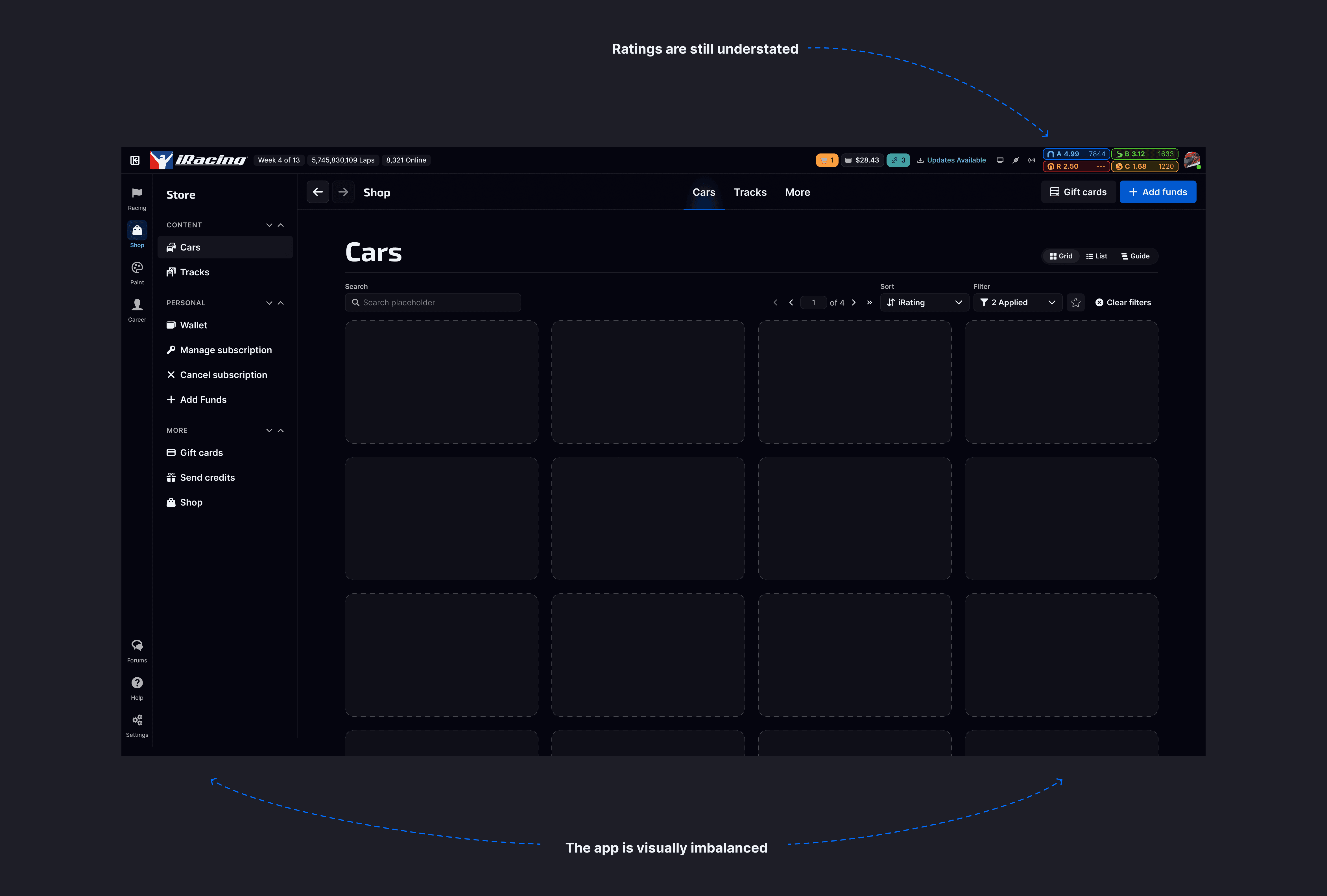
A two-tier sidebar
This was the first model that gave us real hierarchy without sacrificing speed.
Major product areas lived at the top level, while a second contextual level exposed destinations within them.
It reduced clutter without hiding frequently used areas behind another page.


We pressure-tested the idea before building it
Once the two-tier model started showing promise, Jack and I worked through the information architecture together.
I would build a concept, and we would stress-test it against the actual product: where it broke, where it became ambiguous, and whether it could support features we knew were coming.
Jack then led a small round of usability testing to validate the direction.
We were less interested in pass/fail task completion than in how confidently people navigated. The old system was usable, but people tended to hunt.
The new model was much easier to predict.
By late 2022, we had enough confidence to take it to engineering.
Design and engineering happened to be solving adjacent problems
At the same time, the web team had reached a similar conclusion from the technical side.
The existing Bootstrap architecture and older React patterns were becoming difficult to extend, so they had already begun migrating toward Chakra and a more modern front-end foundation.
The timing gave us an opportunity to solve the product and technical problems together. Historically, design and web engineering had worked more like separate service teams.
This project became the beginning of a much closer working relationship.
The first release changed the structure of the app
Jay moved quickly, and we shipped the new navigation in March 2023.

The release included:
the two-tier sidebar
a new overall app shell
persistent license and driver information on the right
a clearer separation between navigation, context, and page content

It also included one important page migration.
Settings
Settings had previously opened in a modal.

In the new navigation model, that immediately felt wrong.
Every other item in the outer navigation changed the page context. Having one item open an overlay created a structural exception we couldn’t really justify.
So Settings became the first feature we pulled out of the modal system entirely.
That forced us to answer a bigger question:
What should an actual iRacing page look and behave like?
We needed a page system, not a stretched-out modal
The old application had never really needed a formal page model.
Modals provided their own context, footer, save actions, cancel behavior, and navigation boundaries.
Once those workflows moved onto pages, all of that had to be designed intentionally.
I created a new page template around a component we call the Billboard.

The Billboard establishes context for the page and can contain:
identity
status
imagery
metadata
page-level actions
local navigation
Below it, the actual content can scale independently.
We also introduced breadcrumbs and child pages so users could move deeper into a feature without falling into another stack of overlays.
Different jobs needed different page shapes
One template wasn’t enough. Feature-heavy areas use a wider layout with a more expressive Billboard and larger content canvas.
Settings and account-management pages use a tighter wrapper and a simpler header.

The underlying structure stays consistent, while the layout adapts to the content.
That gave us a reusable framework instead of solving every page locally.

Removing modals created new interaction problems
Modals quietly solve a lot of interaction details for you. They have an obvious boundary. They have a natural place for Save, Cancel, and Close.
Once editing moved onto pages, those assumptions disappeared.
We had to define patterns for:
changes that apply immediately
changes that require explicit submission
save and cancel behavior
dirty states
validation
error handling
navigating away with unsaved changes
Those patterns are now being used in more complex areas like our League redesign.


Instead of putting another editor inside a modal stack, we can treat the workflow as a proper part of the application.
The system kept growing
As the Chakra migration continued, design and engineering started solving recurring problems as reusable patterns rather than one-off implementations.
The system now includes:
hierarchical navigation
Billboardvariantswide and narrow page templates
breadcrumbslocal page navigation
A
drawerfor filters and contextual informationmulti-step flows
page-based editing patterns
validation and error handling
a shared icon system and visual foundations


Pages are now the default model for new work.
Modals still exist, but we use them when a modal is actually the right interaction instead of as the default container for everything.
The migration is still ongoing
The legacy application had more than 100 modal-based workflows.
We’ve migrated roughly 30–40 of them so far, with several of the largest remaining areas still in progress.
Within the core Racing section, about five of nine major areas now use the newer page structure.
Official Series, Account Settings, and the current League redesign all build on the same foundation.
Bootstrap still exists alongside the new system, but engineering is actively working toward removing it entirely.
As areas are refactored into Chakra, design can either improve them immediately or revisit them later without fighting the old front-end architecture.
The result
The most visible outcome was a better navigation system.
The more important outcome was a better way to build the application.
Before
mostly flat navigation
list-and-table pages
nested modal workflows
local overrides
inconsistent interaction patterns
After
clearer hierarchy
real page depth
reusable page templates
persistent context
predictable navigation
shared interaction patterns
a growing design system
The app is still evolving, but new work no longer has to invent its own structure from scratch.
Looking back
The project started with a sidebar. It became much more than that.
Engineering was already modernizing the front end. We were trying to solve a navigation problem. Once those efforts came together, we had an opportunity to rethink how the application itself should be structured.
The two-tier navigation solved the immediate problem.
Moving Settings out of a modal exposed the next one.
The page system gave us a foundation for everything that followed.
And over time, those individual solutions became a shared way of designing and building iRacing’s web product.
My role
I originated the navigation concept and led the visual and interaction design through implementation.
Jack, our UX designer, led research and usability testing and partnered with me on information architecture.
Jay led front-end engineering and the migration from our legacy Bootstrap stack to Chakra.
The app had outgrown its structure
By 2022, iRacing’s web app had accumulated years of features without a corresponding rethink of how they were organized.
The sidebar was a collection of expandable sections, and most pages were little more than lists or tables that opened the real experience inside modals.
Those modals could stack several levels deep.
A user might open a modal, navigate into another, then another, and lose the entire chain with one close action or accidental scrim click.
The system worked, but it was becoming harder to understand, harder to extend, and harder to maintain.
We tried the obvious fixes first
I spent the summer exploring ways to improve the existing navigation before proposing anything more structural.
Better accordions
The least disruptive option.
Cleaner grouping helped, but the underlying hierarchy was still too shallow for where the product was heading.
A scrolling sidebar
It created more room, but some ideas are better left in the past.
A tiled hub
This felt appropriately “game-like,” but introduced too much travel.
Users had to leave the content area, select a major section, land on a hub, then navigate again before getting where they wanted to go.
It turned a quick action into a journey.
A two-tier sidebar
This was the first model that gave us real hierarchy without sacrificing speed.
Major product areas lived at the top level, while a second contextual level exposed destinations within them.
It reduced clutter without hiding frequently used areas behind another page.
We pressure-tested the idea before building it
Once the two-tier model started showing promise, Jack and I worked through the information architecture together.
I would build a concept, and we would stress-test it against the actual product: where it broke, where it became ambiguous, and whether it could support features we knew were coming.
Jack then led a small round of usability testing to validate the direction.
We were less interested in pass/fail task completion than in how confidently people navigated. The old system was usable, but people tended to hunt.
The new model was much easier to predict.
By late 2022, we had enough confidence to take it to engineering.
Design and engineering happened to be solving adjacent problems
At the same time, the web team had reached a similar conclusion from the technical side.
The existing Bootstrap architecture and older React patterns were becoming difficult to extend, so they had already begun migrating toward Chakra and a more modern front-end foundation.
The timing gave us an opportunity to solve the product and technical problems together. Historically, design and web engineering had worked more like separate service teams.
This project became the beginning of a much closer working relationship.
The first release changed the structure of the app
Jay moved quickly, and we shipped the new navigation in March 2023.
The release included:
the two-tier sidebar
a new overall app shell
persistent license and driver information on the right
a clearer separation between navigation, context, and page content
It also included one important page migration.
Settings
Settings had previously opened in a modal.
In the new navigation model, that immediately felt wrong.
Every other item in the outer navigation changed the page context. Having one item open an overlay created a structural exception we couldn’t really justify.
So Settings became the first feature we pulled out of the modal system entirely.
That forced us to answer a bigger question:
What should an actual iRacing page look and behave like?
We needed a page system, not a stretched-out modal
The old application had never really needed a formal page model.
Modals provided their own context, footer, save actions, cancel behavior, and navigation boundaries.
Once those workflows moved onto pages, all of that had to be designed intentionally.
I created a new page template around a component we call the Billboard.
The Billboard establishes context for the page and can contain:
identity
status
imagery
metadata
page-level actions
local navigation
Below it, the actual content can scale independently.
We also introduced breadcrumbs and child pages so users could move deeper into a feature without falling into another stack of overlays.
Different jobs needed different page shapes
One template wasn’t enough. Feature-heavy areas use a wider layout with a more expressive Billboard and larger content canvas.
Settings and account-management pages use a tighter wrapper and a simpler header.
The underlying structure stays consistent, while the layout adapts to the content.
That gave us a reusable framework instead of solving every page locally.
Removing modals created new interaction problems
Modals quietly solve a lot of interaction details for you. They have an obvious boundary. They have a natural place for Save, Cancel, and Close.
Once editing moved onto pages, those assumptions disappeared.
We had to define patterns for:
changes that apply immediately
changes that require explicit submission
save and cancel behavior
dirty states
validation
error handling
navigating away with unsaved changes
Those patterns are now being used in more complex areas like our League redesign.
Instead of putting another editor inside a modal stack, we can treat the workflow as a proper part of the application.
The system kept growing
As the Chakra migration continued, design and engineering started solving recurring problems as reusable patterns rather than one-off implementations.
The system now includes:
hierarchical navigation
Billboardvariantswide and narrow page templates
breadcrumbslocal page navigation
A
drawerfor filters and contextual informationmulti-step flows
page-based editing patterns
validation and error handling
a shared icon system and visual foundations
Pages are now the default model for new work.
Modals still exist, but we use them when a modal is actually the right interaction instead of as the default container for everything.
The migration is still ongoing
The legacy application had more than 100 modal-based workflows.
We’ve migrated roughly 30–40 of them so far, with several of the largest remaining areas still in progress.
Within the core Racing section, about five of nine major areas now use the newer page structure.
Official Series, Account Settings, and the current League redesign all build on the same foundation.
Bootstrap still exists alongside the new system, but engineering is actively working toward removing it entirely.
As areas are refactored into Chakra, design can either improve them immediately or revisit them later without fighting the old front-end architecture.
The result
The most visible outcome was a better navigation system.
The more important outcome was a better way to build the application.
Before
mostly flat navigation
list-and-table pages
nested modal workflows
local overrides
inconsistent interaction patterns
After
clearer hierarchy
real page depth
reusable page templates
persistent context
predictable navigation
shared interaction patterns
a growing design system
The app is still evolving, but new work no longer has to invent its own structure from scratch.
Looking back
The project started with a sidebar. It became much more than that.
Engineering was already modernizing the front end. We were trying to solve a navigation problem. Once those efforts came together, we had an opportunity to rethink how the application itself should be structured.
The two-tier navigation solved the immediate problem.
Moving Settings out of a modal exposed the next one.
The page system gave us a foundation for everything that followed.
And over time, those individual solutions became a shared way of designing and building iRacing’s web product.
More projects
Case Study

Rebuilding iRacing’s Sim UI
Modernizing a 15-year-old interface without breaking the product people already knew — and creating a foundation that could keep evolving.
Selected Work

iRacing Icon Library
Replacing hundreds of inconsistent assets with a shared visual system.
Selected Work

iRacing Special Events
A flexible identity system for iRacing’s marquee races.
Selected Work

The Laughing Loon
Crafting joyful a identity for Norway, ME's newest casual eatery.
Selected Work

Providence ¡CityArts! For Youth
Defining a brand of inclusivity and creativity for a well established Providence based non-profit.
Just for fun

Custom iRacing Liveries
A collection of paints I've made for my personal racecars in the simulator.